Just like Goldilocks, we’re all looking for that ‘just right’ when surfing the web. It’s a jungle out there with devices of every shape and size! That’s where responsive design sweeps in like Tarzan to save the day. I’ll be your guide on this safari, exploring how responsive design dramatically boosts user experience. Hang onto your hats, it’s going to be a wild ride!
Understanding Responsive Design
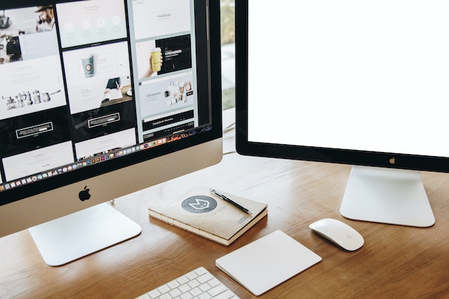
You’ve got to understand that responsive design isn’t just about making things look good on any device, it’s about creating a seamless user experience. It’s like the Swiss Army knife of web design—always ready to adapt and impress, no matter what screen size is thrown at it.
Design constraints? Oh, they’re kind of like the overbearing parents of the design world. They set rules and boundaries. But as we all know from our rebellious teenage years, there are ways around them (Don’t tell my mom!). In comes our superhero – the flexibility approach! This approach teaches us that within these constraints lies potential for creativity and innovation.
Imagine trying to squeeze an elephant into a Mini Cooper; sounds impossible right? That’s pretty much how designers feel when asked to fit a website onto a smartphone screen without losing functionality or aesthetics. But with the flexibility approach, we don’t aim to simply squash everything in; instead, we rearrange elements artfully like an expert Tetris player!
The beauty of responsive design is its ability to respond (get it?) and adapt based on viewing environment. It’s less “one size fits all” and more “made-to-measure”. Basically, if Cinderella had used responsive design for her shoe fitting instead of relying on fairy godmother magic, she wouldn’t have left behind such an expensive glass slipper!
The Role of Responsive Design in User Experience
Well, buckle up folks because we’re about to dive headfirst into the thrilling world of responsive design – it’s not just a buzzword, but a real game changer! You see, this isn’t your grandma’s website design; we’re talking about a kind of digital wizardry that makes websites adjust magically to fit any screen size. But wait, there’s more! Not only does it make life easier for us humble users, but let’s face it – in the epic battle of Design Vs User Experience there can be only one victor and with responsive design in its arsenal, user experience is looking like the heavyweight champion!
Defining Responsive Design
Let’s start by defining responsive design; it’s a web development approach that makes your website adapt to the size of the viewer’s screen. It’s like a one-size-fits-all t-shirt, but for websites. Now, I know what you’re thinking: “Isn’t this just some techno-jargon for ‘it looks good on my phone’?” Well, yes and no.
1) Yes, because it does make things look good on your phone.
2) No, because it also ensures they look good on your tablet, laptop or mega-ultra-super-wide screen (if you’re lucky enough to have one).
3) This is part of Design Evolution – making sure websites keep up with our gadget addiction.
4) And lastly, Adaptive Layouts are the clever cogs making all this happen.
Now let’s dive into some benefits for users – which spoiler alert – there are plenty!
Benefits for Users
So, you’re probably wondering what’s in it for you when a website adapts to fit your screen size. Well, imagine trying to read a billboard through a keyhole – not fun, right? That’s essentially what happens when you browse an unresponsive site on your phone.
Responsive design is like this online superhero that swoops in and saves the day (or rather, our eyes). It ensures navigation simplicity – no more squinting or furious zooming in and out. You can finally enjoy browsing without feeling like you’re playing digital twister with your fingers! The prize? User satisfaction. Your mood lightens up because everything just…fits. And honestly, who doesn’t love things that fit perfectly? Like Cinderella’s glass slipper or the last piece of pizza into my mouth!
Design Vs User Experience
It’s essential to understand that there’s a fine line between aesthetics and functionality when it comes to creating a website. Who knew that Design Psychology and User Preferences would be like an old married couple, constantly bickering but can’t live without each other?
- Design Psychology: It’s like the nagging spouse, always pushing for things to look good. “Why can’t we have more colors?”, “What about this fancy font?”
- User Preferences: The practical partner, just wants everything to work smoothly. “Is the button easily clickable?”, “Can Grandma read the text?”
- The Tug of War: When both try to pull the blanket their way, chaos ensues.
- The Balance: When they agree on something – voila! A perfect user experience.
Remember folks, marriage counseling isn’t just for couples anymore!
Responsive Design and Mobile Browsing
Responsive design’s crucial for mobile browsing because it ensures websites don’t appear distorted on different screen sizes. It’s like having your favorite pair of jeans that fits just right, no matter how many doughnuts you’ve indulged in over the weekend.
Now, let’s talk about some ‘Mobile Optimization Challenges’. Imagine being a tall person at a concert stuck behind someone even taller – frustrating, right? That’s what it feels like when a website isn’t optimized for mobile: everything looks out of place and inaccessible!
Then we have ‘Adaptive vs. Responsive’ debate; an age-old feud akin to Pepsi vs Coke, or cats vs dogs. Adaptive design is the cunning chameleon; changing its form based on the environment (or in our case, device). On the other hand, responsive design is more of a fluid ballet dancer gracefully adapting to any stage size (screen size).
In truth though, both have their strengths and drawbacks. Adaptive might come across as the ambitious overachiever trying to perfect every single platform but ends up stretching itself too thin (like butter spread over too much bread – thank you Bilbo Baggins). Meanwhile, responsive can sometimes be a bit too ‘go with the flow’, morphing into something that doesn’t quite fit all platforms perfectly.
Case Studies: Responsive Design Enhancing User Experience
Let’s dive into some case studies showcasing how adaptable website layouts have improved the way visitors interact with them. But before we do that, remember this: Design Adaptability can be a slippery fish. One moment it’s in your grasp; the next, it slipped away like my chance of winning the lottery when I bought tickets for last week’s draw… not that I’m still bitter.
I’ve seen websites that were as rigid as a plank and just about as interesting to engage with. They had no ‘wiggle room’, no adaptability. It was like trying to squeeze a square peg into a round hole – except in this case, the “hole” was every different device or screen size one could think of! Thankfully, there are also examples where design adaptability has been embraced wholeheartedly and resulted in user engagement skyrocketing faster than Elon Musk’s rocket launches.
1) Amazon: The retail giant is not just good at emptying our wallets but also at making sure their website adapts brilliantly across devices.
2) The Boston Globe: A news site that took design adaptability seriously back when dinosaurs (read: non-responsive websites) roamed the earth.
3) Airbnb: Their responsive design is so seamless you’d swear they’ve got tiny elves adjusting everything perfectly behind the scenes.
4) Starbucks: Coffee lovers unite on any device possible, thanks to their responsive layout.
The Future of Responsive Design in UX
Hold onto your hats, folks, because we’re about to peer into the crystal ball of responsive design! I’m no psychic but I’ve got a few predictions up my sleeve about emerging trends that are set to shake up our beloved UX world. So grab some popcorn and let’s embark on this wild ride to the future of design, where the only guarantee is that you won’t need 3D glasses!
Emerging Trends
You’re going to notice an increase in the use of minimalistic design and augmented reality in responsive designs due to their emerging popularity. It’s like they’ve been hitting the gym and now they’re ready to flex those tech muscles. These trends are sprouting faster than grey hairs on a stressed designer.
Here’s the hot list:
- Augmented Reality Impact: It’s not just for catching Pokémon anymore, folks!
- Minimalistic Design: Less is more, unless we’re talking about pizza slices.
- Virtual Reality Trends: Making your sci-fi dreams come true since…well, very recently actually!
- Increased Interactivity: Because who doesn’t love feeling like they can poke stuff on their screens?
Design Predictions
In considering future trends, it’s essential to speculate on possible design predictions that could shape your interaction with the digital world. Design Sustainability and AI Integration might just be the new black in town. Imagine walking down a virtual street where every billboard is personalized just for you – creepy or cool? You decide!
On a serious note, though, this trend isn’t as far fetched as my attempt at stand-up comedy! It’s about time we start using artificial intelligence more wisely than asking Siri to tell us a joke. Incorporating AI in design can make our user experience feel like we’re at an all-you-can-eat buffet of relevancy. And let’s not forget about sustainability – because who wants their digital footprint to be larger than Bigfoot’s?!
Best Practices for Implementing Responsive Design
It’s crucial to understand and implement best practices for responsive design to significantly enhance user experience. When we talk about Design Adaptability, it’s like being at a buffet – you’ve got to have something for everyone. And with Platform Compatibility, you’re the DJ trying to make sure every song (read: platform) gets its time in the spotlight.
Now, here are four tips that could save your website from becoming as obsolete as my grandma’s old typewriter:
- Flexible Layouts: This isn’t yoga! But think of your website layout like a pretzel – it should twist and turn according to screen size without breaking apart.
- Optimal Media: No one likes pixelated images except maybe 8-bit gamers. Always ensure high-resolution media that scales well!
- Seamless Navigation: If getting through your site feels like solving a Rubik’s cube, you’re doing it wrong.
- Platform-Specific Features: Not all platforms speak the same language; learn their dialects and code accordingly.
Remember when Spiderman said “With great power comes great responsibility”? Well, he might as well have been talking about responsive design! It can be tricky but hey, if Peter Parker can swing from buildings while battling villains, surely we can handle some HTML coding!
Conclusion
Well, folks, that’s all the lowdown on responsive design and user experience. Bet you didn’t know that 57% of users won’t recommend a business with a poorly designed mobile site! Just like wearing socks with sandals, it’s not a good look. So let’s keep our digital world snazzy and user-friendly. Remember when in doubt, think responsive design or risk being fashionably late to the tech party!